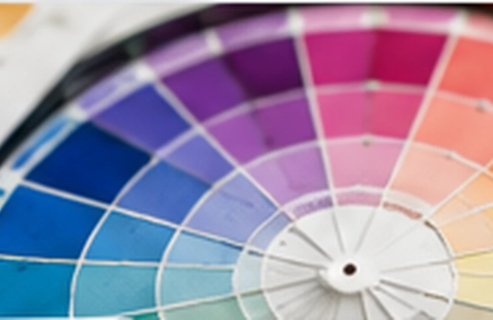
What colour temperature means
Colour temperature is a way of describing the visual impression of a hue. Reds, oranges, and many yellows are commonly described as warm. Blues, blue-greens, and many violets are commonly described as cool. Temperature is relational: a yellow can look cooler beside an orange yellow, while a blue can look warmer beside a green blue.
How warm colours behave
Warm colours can feel energetic, welcoming, lively, or intimate. They often attract attention, which makes them useful for focal points, calls to action, and social spaces. Strong warm colours can dominate a composition, so they are often balanced with softer tints, muted shades, or cooler supporting hues.
How cool colours behave
Cool colours are often associated with calm, clarity, distance, and quiet. Blues and blue-greens can create a restful feeling in interiors or provide a stable base for visual identities. Very cool palettes can feel flat if every colour has similar value, so add contrast through lightness, texture, or a warmer accent.
Combining temperature
A palette does not need to be entirely warm or cool. Pairing a warm accent with a cooler base can create visual focus. Check how the colours behave in the actual light and material where they will be used; screens, paint finishes, fabrics, and surrounding colours can shift perception.
Frequently asked questions
What are warm colours?
Warm colours are hues commonly associated with red, orange, and yellow families.
What are cool colours?
Cool colours are hues commonly associated with blue, green-blue, and some violet families.
Can warm and cool colours be used together?
Yes. A warm accent against a cool base can create balance and emphasis when their values and saturation are considered.
Keep exploring
Browse more colour theory guides or return to the ColourMatching.com home page for more practical colour resources.