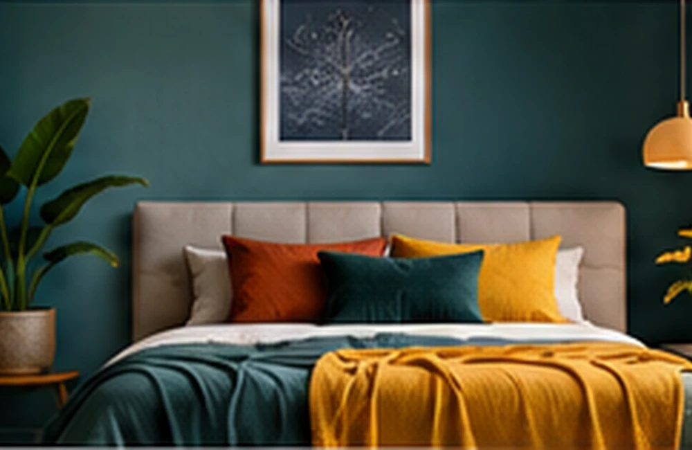
What analogous colours are
Analogous colours sit next to each other on the colour wheel. A scheme might combine blue, blue-green, and green, or yellow, yellow-orange, and orange. Because the hues share visual characteristics, these palettes often feel cohesive.
Choose a dominant hue
Select one colour to carry most of the visual weight. Use neighbouring hues to support it, rather than giving every colour equal importance. A dominant hue helps the composition feel organised and prevents the palette from becoming a collection of competing swatches.
Create separation and hierarchy
Neighbouring hues can have similar visual values, so use differences in lightness and saturation to create structure. A dark anchor, a lighter supporting colour, and a small accent can make an analogous scheme easier to read.
Where it works well
Analogous palettes suit landscapes, calm interiors, editorial illustrations, and visual identities that need a consistent mood. They are especially useful when the design should feel unified rather than high-contrast.
Frequently asked questions
How many colours are in an analogous scheme?
A simple scheme often uses three neighbouring hues, but broader palettes can include more variations.
Are analogous colours low contrast?
They tend to have less hue contrast than complementary schemes, so value and saturation differences can provide hierarchy.
Can analogous colours be used in branding?
Yes. They can create a cohesive identity, particularly when supported by a strong neutral and clear contrast rules.
Keep exploring
Browse more colour combinations guides or return to the ColourMatching.com home page for more practical colour resources.